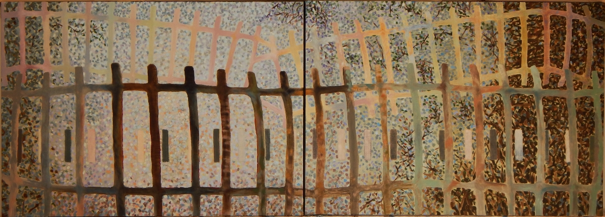
tablet sketch 150317
Tablet Sketch 150317

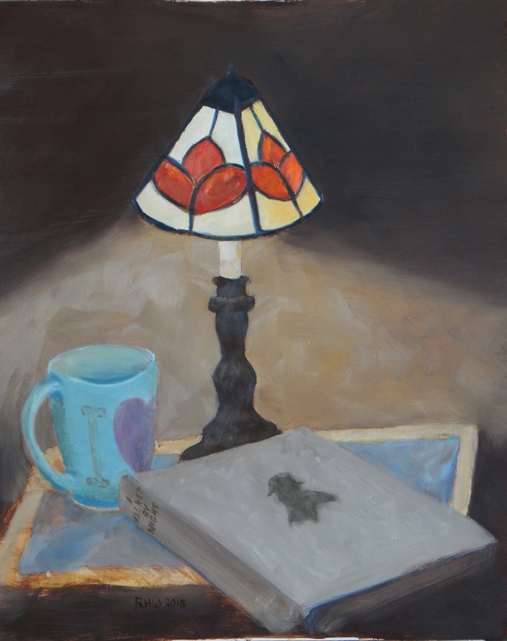
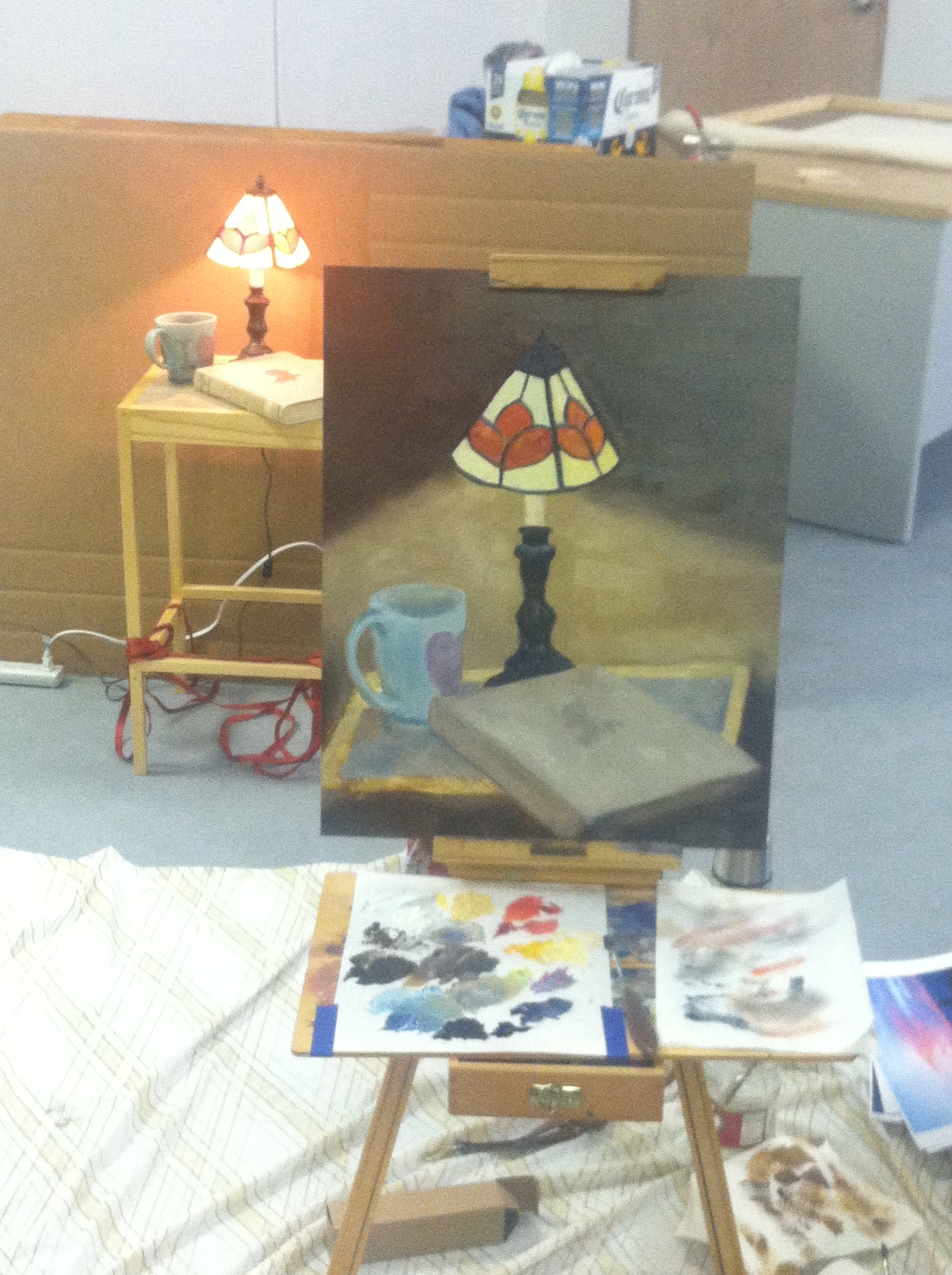
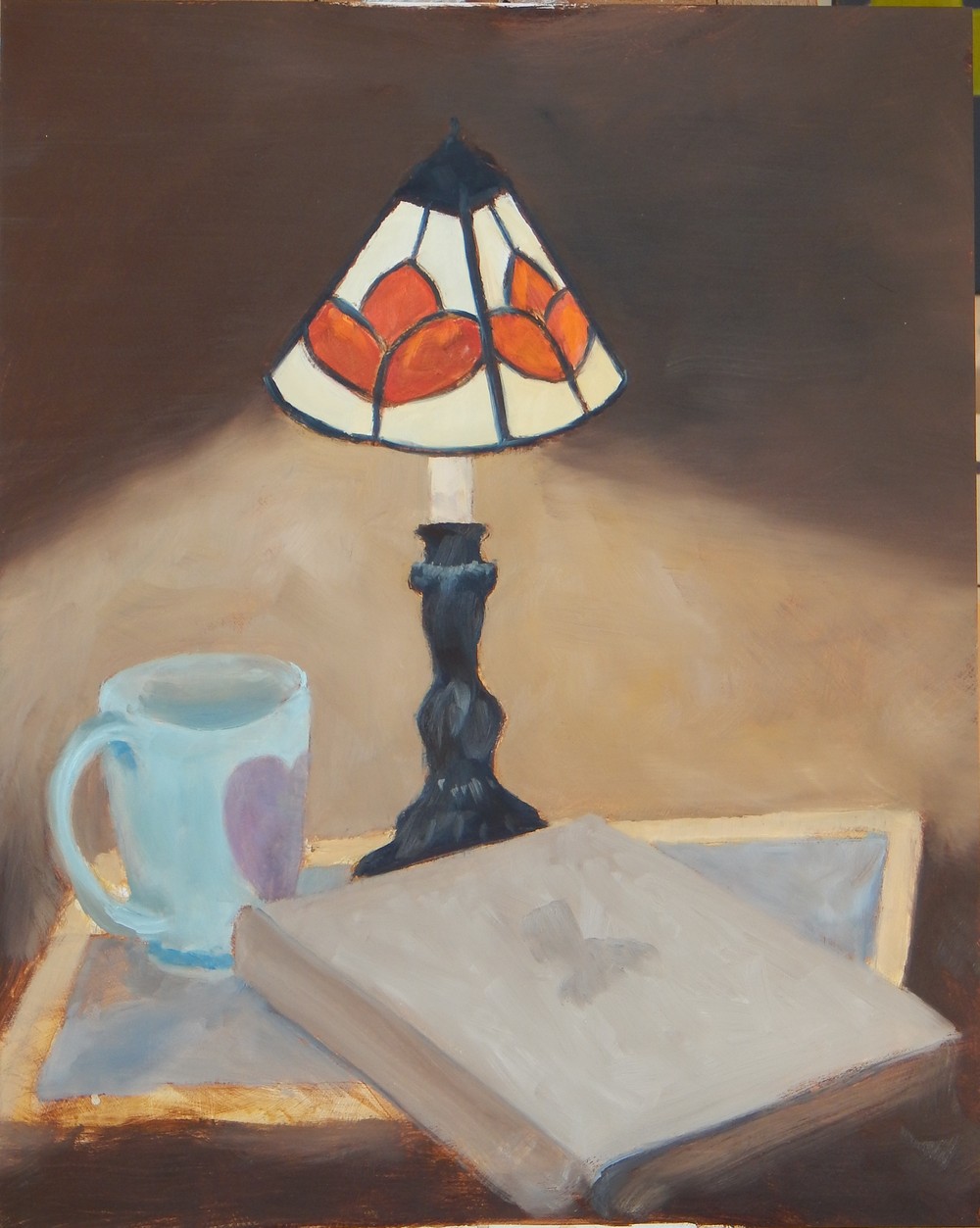
Touched up the first class painting, and here it is.
 Here’s what changed:
Added some cadmium yellow and raw sienna to the right side shade. Should be obvious where, the four yellowish panes of the lampshade. That helps a lot in making the shade turn the corner. Notice that i left all the little bits of underpainting and roughness to the painting of the panes. I think it helps the shade look “real”.
Repainted the cup. It looks so blue in this photo, but is not so glowing in person. It is very blue, however. Areas around the lower cup handle were readjusted, just added a little paint to the table top right there.
Painted in the book title and darkened the cover illustration just a bit.
Made the lamp base more brown, and with the yellow-brown background color (burnt umber, cadmium yellow, raw sienna, white) fixed some drawing eccentricities. And, BTW, the lampshade does tip over to the right like that in real life.
 Here’s a closeup of the lampshade.
 A closeup of the book and the lamp base.

Here’s a photo from the demo painting, How to Start Painting in Oils class Saturday January 31. Looks pretty pathetic at this point. Not a very strong composition. It should be possible to improve it a lot, however. Soon as it dries enough to work over i’ll post the completion.

Thanks for the photo Laurie. This is from the class on Jan 17, 2014.
And thanks to Rosy for this one.
Here’s the class demo painting, from the painting class on Jan 17th. The first image is just a “raw” shot of the painting, but trimmed down quite a bit in pixel density. (If you’d like to get the max 3MB+ JPG pixel count, i’d be happy to email it to you.) Second image is annotated, and a lot of comments follow. The third image shows some lines added to show some compositional triangles.
On the whole i’m happy this turned out as well as it did. This image is the painting as-is when the class ended. It can be fixed up quite a bit. The cup is way to light in value, and the color of the cup can use some more raw sienna, or some brown added to it. That’s the second most immediate area to fix. But read on …
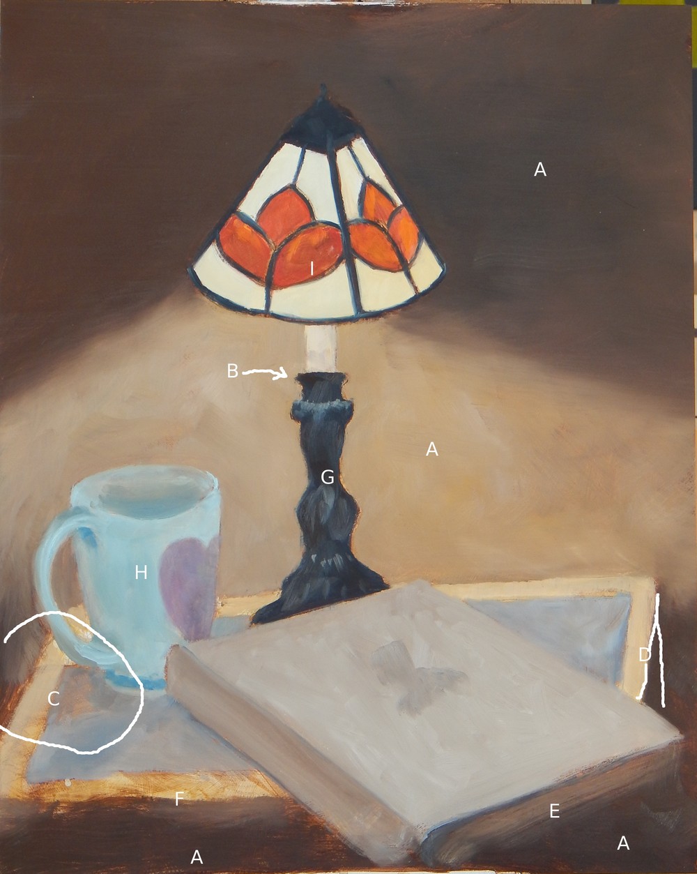
Note the letters A-I labeling parts of the painting.
A: The overall tone of this painting is pretty rich. The background is pretty close to pure burnt umber, blues, cadmium yellow, and some raw sienna. There is some raw umber in the darkest areas, but the painting has a lot of saturated color. That’s not usually how i paint, but it does have a glowing effect. Hmmmmm. The dark areas A create a vignette around the central lighted area, a compositional trick. There is a certain amount of titanium white mixed in, but the overwhelming amount of burnt umber and cadmium yellow in the middle section make it very colorful.
B: Ooops, the top of the metal lamp base turns down, not up. It makes you think you are below that level, rather than above it, as the entire rest of the painting makes clear. Fix that easily.
C: I really like the area C, circled. This is a good example of letting the underpainting alone. I would have wished that the shadow in C were a little darker though. This can be done with a little glazing, later, darkening without obscuring the bottom layer of paint.
D: Ok, the perspective is off. See the angle drawn at D. If you make the angle of the table “correct”, however, you’re going to have a vertical line exactly parallel to the edge of the painting. That’s going to be a very boring shape. Since i don’t think it’s all that objectionable, i want to keep the more interesting shape. No change.
E: I do like the bottom edge of this book. It’s soft, and reads correctly with a minimum of fuss. Yes! The book in general is ok. A little touch up on the shadow from the spine needs to be studied. The book title added to the upper spine will add a lot of convincing detail and a little focal point that will be good at that spot. The image in the middle of the cover can be darkened and made just a bit more explicit (burnt umber + blue glaze brushed on lightly). There is a bit more texturing on the book cover that would be nice, just little touches to indicate the cloth texture.
F: I really really like how the closest edge of the pine table comes through from the underpainting. Getting that soft buttery look of the warm light on varnished pine is a major goal of the painting. It would be nice to try to get a bit of the effect at F on to the upper right triangle of wood framing too. Not too much, however, or the two locations will compete with each other.
G: The lamp base i feel is way too blue. In actuality it is bronze color. The blue hue does make it contrast with all the yellows and browns, probably too much. I would paint over the base with a much more brown color, leaving some blue in the shadows. The highlights were added at the last minute. They could be more neatly done without being too fussy.
H: The cup just did not come together. It can be fixed, however. Except for the rim, the shape is ok. I believe that just darkening it up, glazing again, will make it harmonize with the lamp.
I: Finally, the lampshade is not bad, but there are some wayward blobs of color that could be tamed. A little more yellow on the right side of the shade, the plane turned away from us, will immensely help the 3-D quality. At the time, there was so much wet yellow paint on there, very close to wet blue-brown, it wasn’t possible to do that. Another easy fix that will help this painting a lot. I’m not sure about the cant of the top piece. It appears the angle is too sharp, indicating a viewer position much higher than it should be. That might be easy to fix if the other changes don’t make it unnecessary. If you look really closely at the shade you’ll see a lot of the underpainting in bits of burnt umber not covered by painting in the lead lines. The brown kind of shadows those black lines. That seems to add quite a bit of volume to the shade, although it’s not immediately noticeable. That’s something to be sure to retain when making changes.
Love to hear your comments also.
I’ve drawn in a number of lines to indicate some compositional triangles. What’s really more important is the area where the upper left corner of the book, the cup, the lamp base, and the table come together. That needs to have a pleasing relationship. A bit more can be done there with shadows to make more pleasing.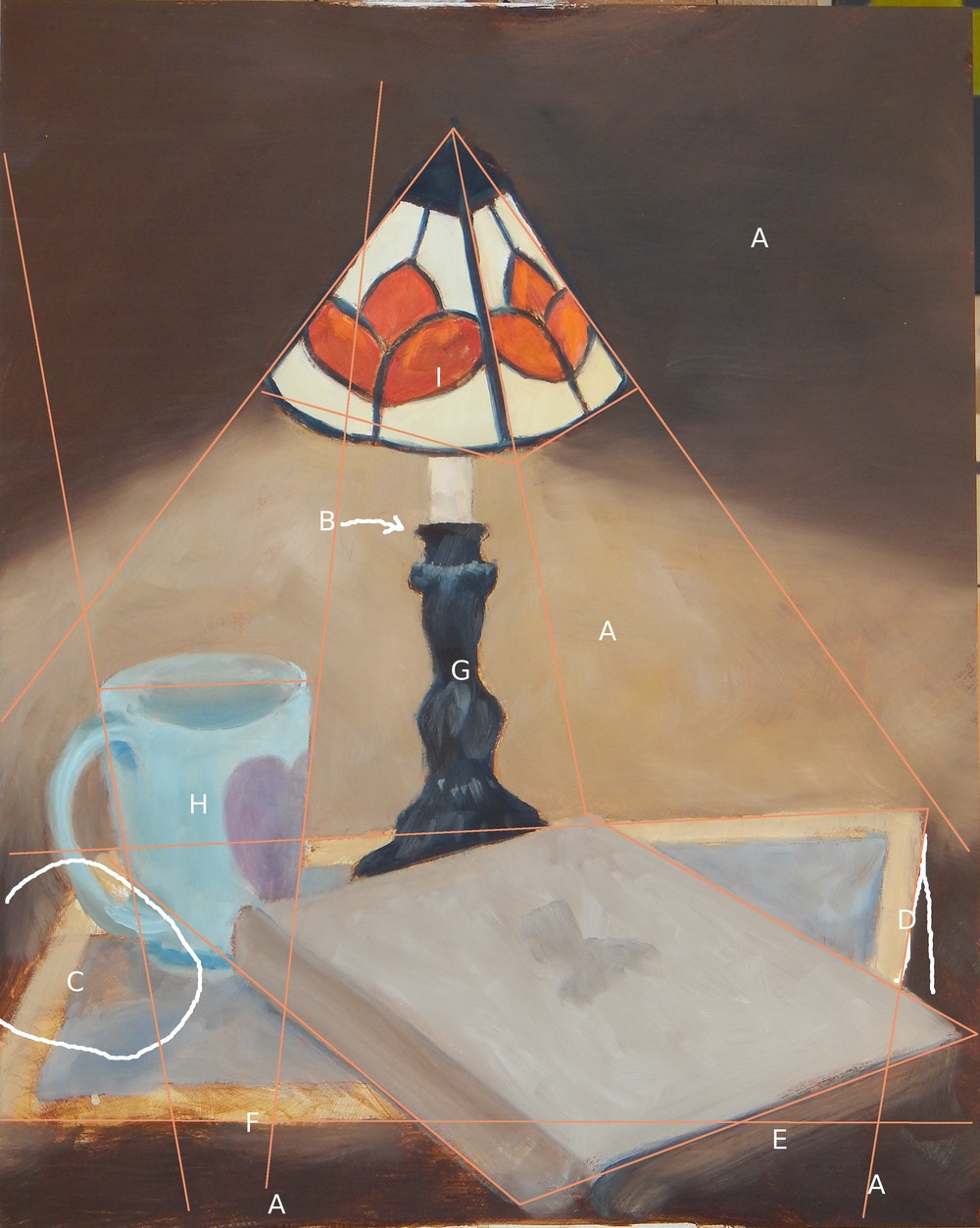
Here’s a photo from yesterday’s painting class. Location works out great, Mountain Sage Gallery in Helena.
Doing this class, How to Start Painting in Oils again January 31.
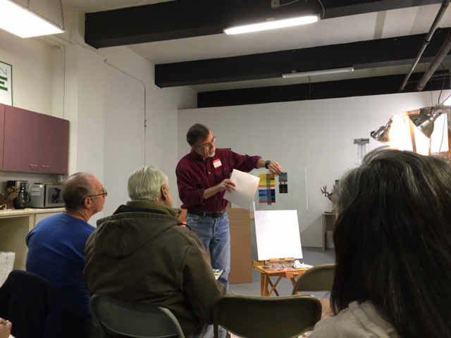
Bob and a color chart.

Oil painting class — see previous post — location is set for Jan 17 at Mountain Sage Gallery. The gallery is at 433 N Last Chance Gulch, Helena.
This is near finished i think. Not that i won’t make some changes.